

Photo by Aaron Burden on Unsplash
When you choose a book to read, choose it well. Life is too short to read bad books. If a book doesn’t give you anything, leave it alone and pick up another. Maybe that book will be ideal for someone else but not for you. Today I want to suggest two books I read with pleasure and have broadened my horizons. The two books are:
Chart Spark by Alli Torban,
Making Numbers Count by Chip Heath and Karla Starr.
Chart Spark by Alli Torban

The first book is Chart Spark and is written by Alli Torban. The book has nothing to do with graphs nor does it explain how to make exceptional graphs. Instead, this book is about creativity and how to apply it to your field of work.
According to Ally, you don’t have to be a genius to be creative. You just need to practice a little and be careful. Throughout the book, Ally describes techniques to become creative. I’ll mention one that is enough for all: take inspiration especially from the world of art, cinema, theater. Bring their ideas to your field of work and you’ll be a winner.
I had the pleasure of chatting directly with Alli on LinkedIn and I have to say she is a fantastic person, very kind and helpful. So, what are you waiting for? Read her book and you will become truly creative in your work.
Let’s take an example of how to apply Alli Torban’s suggestions in your work. Suppose you are a data scientist who wants to communicate the results of your analysis to a general audience. Suppose you also love good food and are an excellent cook. According to the strategies proposed by Alli Torban in her book, you could try and combine the two things: data science and cooking. You understood correctly: combining two things that apparently have nothing in common. Finding something in common between the two fields could be truly innovative and creative. This is where creativity comes into play. For example, you could think of presenting the results of your analysis as a recipe, in which you first give the ingredients and then the preparation procedure.
In the age of ChatGPT, let Artificial Intelligence help you in your creativity. Just for fun, the following figure shows an image generated with Copilot, using the following prompt: create an image with a bar chart in a cooking pot.
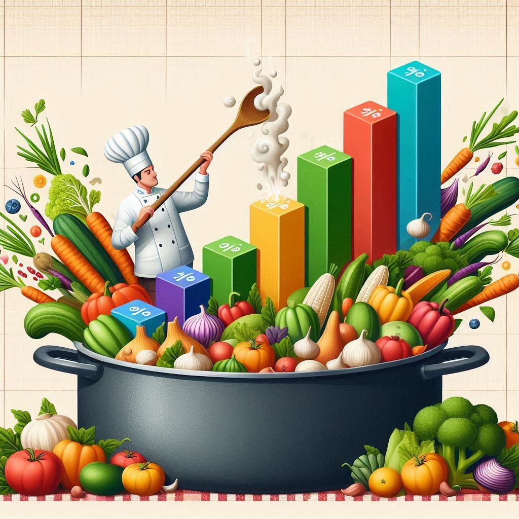
Image generated with Copilot
As an application of what Alli Torban proposed in her book, I tried to mix two of my passions: data storytelling and origami. You heard right: origami!
Yes, just for the record, I developed this passion thanks to my two children, who play with paper all the time.
I thought of building a pyramid with origami that represented the DIKW (Data-Information-Knowledge-Wisdom) pyramid that I describe in my book Data Storytelling with Altair and AI to transform data into story.
The following figure shows the template to build the origami and that you can also download here:

Origami of the DIKW pyramid (by Author)
In this video tutorial I show you directly how to build the pyramid:
So, my suggestion is:
Combine your hobbies with your work and the result will be amazing! Also use Artificial Intelligence to get ideas for your creativity!
Making Numbers Count

Image by Author
The second book I had the pleasure of reading is Making Numbers Count, written by Chip Heath and Carla Starr. This exceptional book explains how to communicate numbers, defining different strategies, which I do not want to spoil, but which are very interesting. I will tell you just one, which shocked me, but which I think is true: when you have discovered something in your data, communicate what you have discovered, not the data. The data are therefore fundamental to extract an insight, that is, something relevant from the data, but not necessary to communicate what you have discovered. In communication, therefore, the data itself may not be useful, while in the analysis phase it is fundamental.
I try to give a practical example to understand the importance of the issue. I take the example from the first chapter of my book, Data Storytelling with Altair and AI. Imagine having data on the participation of people in an event dedicated to animals. Imagine having the data in the following table:

Image by Author
For data analysis purposes, it is essential to keep all the rows of the data set. But for communication purposes, it does not make much sense to keep the row Other as well. It only generates noise.
So, eliminate the useless data, extract the insight and communicate that.
The insight in this case is simply that out of ten participants nine are interested in cats. You can also not use any graph to communicate your finding. Or you can use a bit of creativity to represent it. For example, you can use a simple bar, which is always better than the classic column chart, as shown in the following figure:

Image by Author
Summary
From reading these two books, a fundamental concept emerged: if you want to effectively communicate what you have discovered with your data, use creativity, not only data.
I hope I have convinced you that to communicate an insight, a pinch of creativity is more important than the exact number represented by the data. At least that is my experience. If you then have to do an in-depth analysis of the data, the story changes: use maximum precision.
评论